Wedding season will soon be in full swing. During cocktail hour or the first course at dinner, a common question that guests ask each other is how they know the happy couple. The answers that come up are localized to particular individuals, which means it’s difficult to get a big picture understanding of how entire groups of people converge to celebrate the start of a marriage.
Thinking about this shortly before our own wedding last April, Kate (who’s now my wife 😃) and I conducted a social network analysis of the guests who would celebrate with us on our special day. We gathered a list of our 134 guests and placed their names down column A and across row 1 of an Excel spreadsheet, creating a 134 x 134 adjacency matrix. Each entry represents if two guests had previously met (0 = no, 1 = yes). It took us a couple hours spread over a few days to fill in the matrix, but we ended up with the following. Guests’ names are row and column labels. White squares mean the two guests hadn’t met and black squares mean they had met. Every square along the diagonal is black since guests have obviously met themselves.
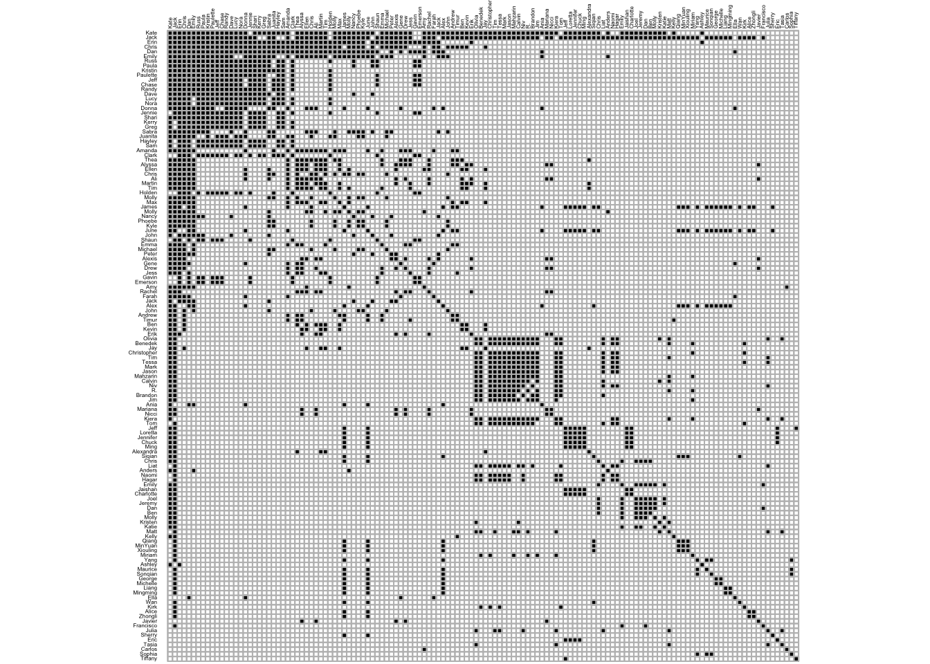
A few things pop out:
- It’s symmetrical. So instead of filling in all \(134^{2}\) entries, we just filled in a little under half, \(\frac{134^{2} - 134}{2}\).
- Already there’s structure (when guests are organized by their loading on the first principal component) In the upper left corner is the biggest cluster of guests who had all met before, which is Kate’s extended family. Closer to the middle is a smaller but still sizeable cluster of guests who had also met before, which are people in my lab.
- The matrix is relatively sparse. Most squares are white, so many hadn’t met other guests before. This makes sense since we invited people from different parts of our lives: family from China and Chicago, classmates from New Jersey, and colleages in Boston.
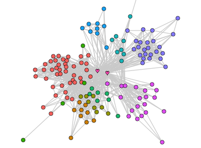
To get a clearer picture of our wedding guests’ relation to one another, we convereted the adjacency matrix to the social network below. Each circle represents a person, the hearts represent me and my wife, and the grey lines indicate that the two people who are connectected had previously met. The structure results from the Fruchterman–Reingold algorithm, which basically repels unconnected nodes and attracts connected nodes. What’s cool is that this algorithm picks up on clusters that make intuitive sense (see legend colors).
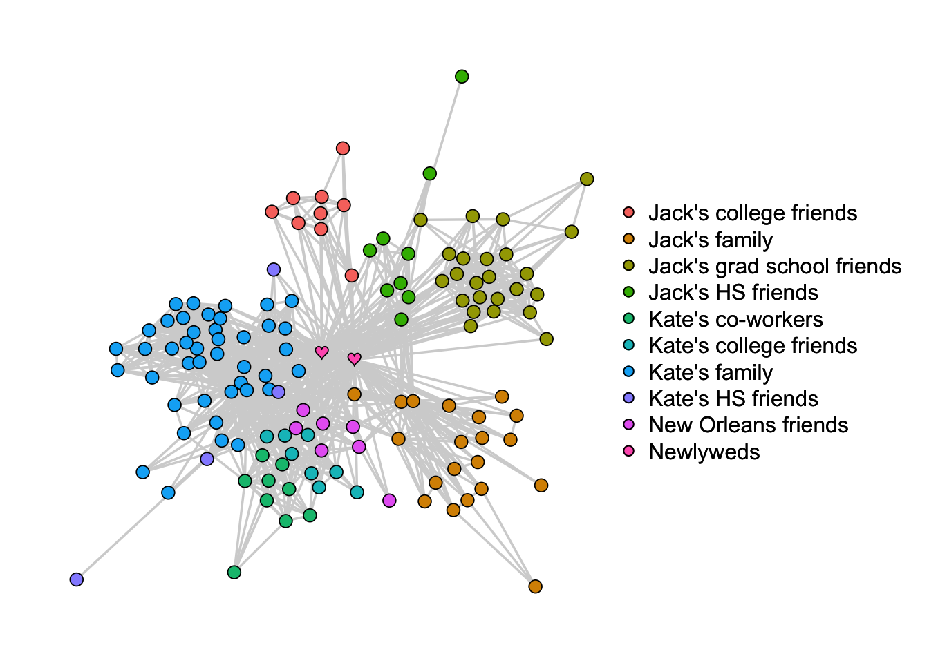
Kate and I are in the middle and have the most connections since it’s our wedding. It’d be strange if it were any other way. The people on the outer bounds of the network with only few connections were plus ones.
Something that wasn’t obvious to us until we saw the network is that there are more connections among Kate’s friends, co-workers, and family than there are among mine. Whereas the left side of the network (Kate’s) is close together, the right side (mine) is more separated. Apparently I lead a pretty comparmentalized life. 🤔
Mapping out a wedding’s social network could be useful for assigning guests to tables at dinner. It might also help in identifying bridges between different groups of people. At the very least, you could print it on a poster for guests to look at during cocktail hour. I’m quite certain this poster got more visitors than all the posters I’ve presented in grad school combined. 😂
